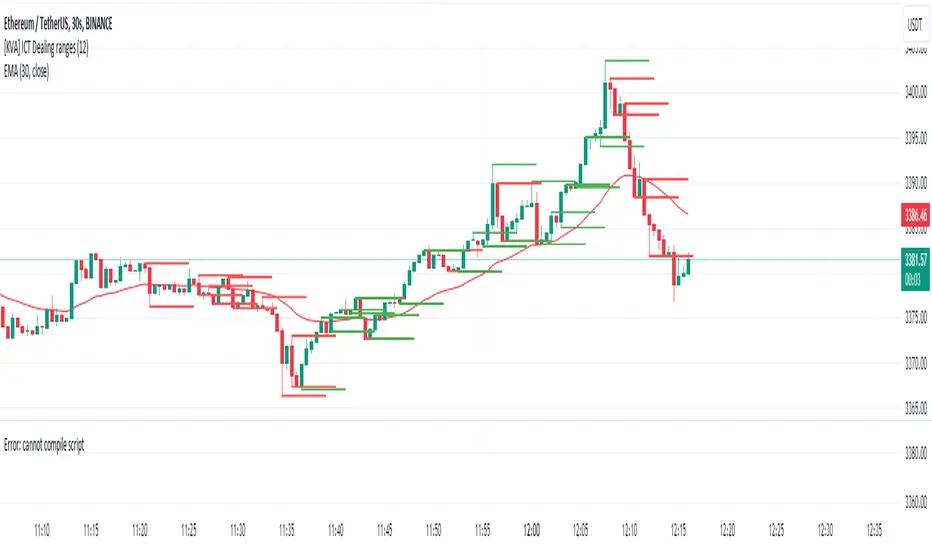
[KVA] ICT Dealing rangesNaive aproach of Dynamic Detection of Dealing Ranges:
The script dynamically identifies dealing ranges based on sequences of upward or downward price movements. It uses arrays to track the highest highs and lowest lows after detecting two consecutive up or down bars, a fundamental step towards understanding market structure and potential shifts in momentum.
ICT Concept: Order Blocks & Fair Value Gaps. This aspect can be linked to the identification of order blocks (bullish or bearish) and fair value gaps. Order blocks are essentially the last bearish or bullish candle before a significant price move, which this script could approximate by identifying the highs and lows of potential reversal zones.
Red and Green Ranges for Bullish and Bearish Movements:
The script separates these movements into red (bearish) and green (bullish) ranges, effectively categorizing potential areas of selling and buying pressure.
ICT Concept: Liquidity Pools. Red ranges could be indicative of areas where selling might occur, potentially leading to liquidity pools below these ranges. Conversely, green ranges might indicate potential buying pressure, with liquidity pools above. These areas are critical for ICT traders, as they often represent zones where price may return to "hunt" for liquidity.
Horizontal Lines for High and Low Points:
The indicator draws horizontal lines at the high and low points of these ranges, offering visual cues for significant levels.
ICT Concept: Breaker Blocks & Mitigation Sequences. The high and low points of these ranges can be seen as potential breaker blocks or areas for future mitigation sequences. In ICT terms, breaker blocks are areas where institutional orders have overwhelmed retail stop clusters, creating potential entry points for trend continuation or reversal. The high and low points marked by the indicator could serve as references for these sequences, where price might return to retest these levels.
Customizability and Historical Depth:
With inputs like rangePlot and maxBarsBack, the indicator allows for customization of the number of ranges to display and how far back in the chart history it looks to identify these ranges. This flexibility is crucial for tailoring the analysis to different trading strategies and timeframes.
ICT Concept: Market Structure Analysis. The ability to adjust the depth and number of ranges plotted caters to a detailed market structure analysis, an essential component of ICT methodology. Traders can adjust these parameters to better understand the distribution of buying and selling pressure over time and how actions have shaped price movements.
Pesquisar nos scripts por "horizontal line"
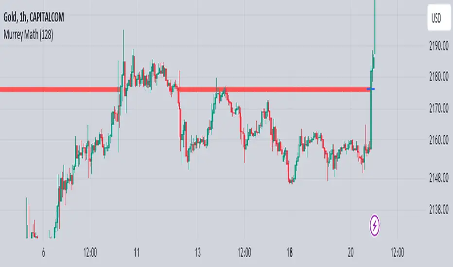
Murrey Math
The Murrey Math indicator is a set of horizontal price levels, calculated from an algorithm developed by stock trader T.J. Murray.
The main concept behind Murrey Math is that prices tend to react and rotate at specific price levels. These levels are calculated by dividing the price range into fixed segments called "ranges", usually using a number of 8, 16, 32, 64, 128 or 256.
Murrey Math levels are calculated as follows:
1. A particular price range is taken, for example, 128.
2. Divide the current price by the range (128 in this example).
3. The result is rounded to the nearest whole number.
4. Multiply that whole number by the original range (128).
This results in the Murrey Math level closest to the current price. More Murrey levels are calculated and drawn by adding and subtracting multiples of the range to the initially calculated level.
Traders use Murrey Math levels as areas of possible support and resistance as it is believed that prices tend to react and pivot at these levels. They are also used to identify price patterns and possible entry and exit points in trading.
The Murrey Math indicator itself simply calculates and draws these horizontal levels on the price chart, allowing traders to easily visualize them and use them in their technical analysis.
HOW TO USE THIS INDICATOR?
To use the Murrey Math indicator effectively, here are some tips:
1. Choose the appropriate Murrey Math range : The Murrey Math range input (128 by default in the provided code) determines the spacing between the levels. Common ranges used are 8, 16, 32, 64, 128, and 256. A smaller range will give you more levels, while a larger range will give you fewer levels. Choose a range that suits the volatility and trading timeframe you're working with.
2. Identify potential support and resistance levels: The horizontal lines drawn by the indicator represent potential support and resistance levels based on the Murrey Math calculation. Prices often react or reverse at these levels, so they can be used to spot areas of interest for entries and exits.
3. Look for price reactions at the levels: Watch for price action like rejections, bounces, or breakouts at the Murrey Math levels. These reactions can signal potential trend continuation or reversal setups.
4. Trail stop-loss orders: You can place stop-loss orders just below/above the nearest Murrey Math level to manage risk if the price moves against your trade.
5. Set targets at future levels: Project potential profit targets by looking at upcoming Murrey Math levels in the direction of the trend.
7. Adjust range as needed: If prices are consistently breaking through levels without reacting, try adjusting the range input to a different value to see if it provides better levels.
In which asset can this indicator perform better?
The Murrey Math indicator can potentially perform well on any liquid financial asset that exhibits some degree of mean-reversion or trading range behavior. However, it may be more suitable for certain asset classes or trading timeframes than others.
Here are some assets and scenarios where the Murrey Math indicator can potentially perform better:
1. Forex Markets: The foreign exchange market is known for its ranging and mean-reverting nature, especially on higher timeframes like the daily or weekly charts. The Murrey Math levels can help identify potential support and resistance levels within these trading ranges.
2. Futures Markets: Futures contracts, such as those for commodities (e.g., crude oil, gold, etc.) or equity indices, often exhibit trading ranges and mean-reversion trends. The Murrey Math indicator can be useful in identifying potential turning points within these ranges.
3. Stocks with Range-bound Behavior: Some stocks, particularly those of large-cap companies, can trade within well-defined ranges for extended periods. The Murrey Math levels can help identify the boundaries of these ranges and potential reversal points.
4. I ntraday Trading: The Murrey Math indicator may be more effective on lower timeframes (e.g., 1-hour, 30-minute, 15-minute) for intraday trading, as prices tend to respect support and resistance levels more closely within shorter time periods.
5. Trending Markets: While the Murrey Math indicator is primarily designed for range-bound markets, it can also be used in trending markets to identify potential pullback or continuation levels.
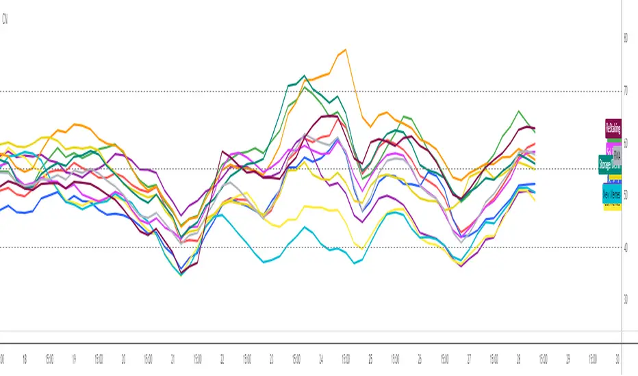
Crypto Narratives: Relative StrengthThis indicator offers a unique perspective on the crypto market by focusing on the relative strength of different narratives. It aggregates RSI data from multiple tokens associated with each narrative, providing a comprehensive view of the sentiment and momentum behind these themes. You can use it to take profit, find W bottoms or M tops to enter and exit narratives. and generally see what hot at the moment with lots of pretty colours.
This indicator tracks the relative strength of various crypto narratives using the Relative Strength Index (RSI) of representative tokens. It allows users to gauge the momentum and sentiment behind different themes in the cryptocurrency market.
Functionality:
The indicator calculates the average RSI values for the current leading tokens associated with ten different crypto narratives:
- AI (Artificial Intelligence)
- Ordinals
- DeFi (Decentralized Finance)
- Memes
- Gaming
- Level 1 (Layer 1 Protocols)
- Sol Betas (Solana Ecosystem)
- Storage/DePin
- RWA (Real-World Assets)
- ReStaking
he average RSI values for each narrative are calculated by summing the RSI values of the associated tokens and dividing by the number of tokens. The indicator plots the 3-period simple moving average (SMA) of each narrative's RSI using different colors and line styles.
Users can customize the RSI length, line width, and label offset through the input options. If the "Show Labels" option is enabled, the indicator displays labels for each narrative's RSI value on the most recent bar.
The indicator also includes horizontal lines representing overbought and oversold levels, which can be adjusted through the input options. Alerts are triggered when a narrative's RSI crosses above the overbought level or below the oversold level. The alerts include the narrative name, RSI value, and a suggestion to consider selling or buying.
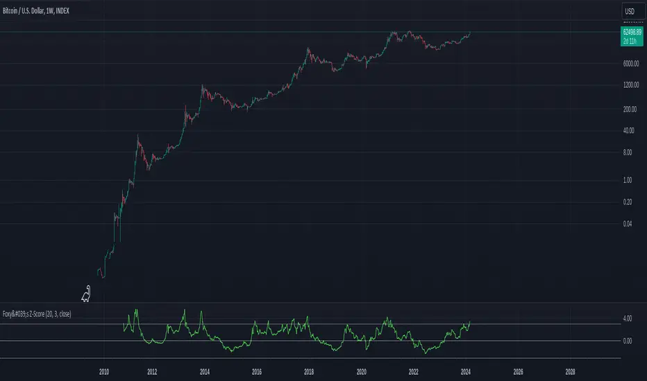
Foxy's Z-ScoreIntroducing Foxy's Z-Score Indicator, a powerful tool for identifying potential trend reversals and market anomalies. This indicator calculates the Z-Score of the closing price, which represents the number of standard deviations from the mean, providing valuable insights into the market's behavior.
Key Features:
Auto Length Selection: The script automatically selects the optimal length based on the selected timeframe, ensuring accurate calculations and relevant signals.
Customizable Length and Standard Deviations: Users can manually input their preferred length and standard deviation values, offering flexibility to adapt to various trading strategies and market conditions.
Visual Representation: The indicator plots the Z-Score line along with three horizontal lines representing the standard deviation values, making it easy to identify overbought and oversold conditions.
Multiple Timeframes: The indicator works seamlessly across different timeframes, allowing traders to analyze short-term and long-term trends.
By incorporating Foxy's Z-Score Indicator into your trading toolkit, you can enhance your ability to spot potential market reversals and make more informed trading decisions.
Sadgir Patterns with SL/TPThe "Sadgir Patterns with SL/TP" is a cutting-edge trading indicator designed for traders seeking to leverage the power of Hull Moving Averages in conjunction with phase accumulation analysis. This unique indicator, developed on the Pine Script platform, is ideal for various markets, including stocks, forex, cryptocurrencies, and commodities.
Key Features:
Adaptive Hull Moving Average: Utilizes an adaptive Hull Moving Average, which provides a smooth and responsive moving average line, aiding in identifying trend directions and potential market reversals.
Phase Accumulation Analysis: Integrates phase accumulation calculations to dynamically adjust the length of the Hull Moving Average, ensuring that the indicator stays in sync with market conditions.
Signal Generation: Generates clear "Long" and "Short" signals, which are visually represented on the chart, assisting traders in making informed decisions.
Dynamic Stop Loss and Take Profit Levels: Automatically calculates and plots dynamic stop loss (SL) and take profit (TP) levels as horizontal lines on the chart, based on user-defined percentage settings. These levels adjust in real-time with the price action, offering a systematic approach to risk management.
Customizable Settings: Provides users with the flexibility to adjust the source of the moving average, power settings for the Hull Moving Average, cycles, and powers for phase accumulation, as well as the percentage values for SL and TP levels.
Visual and Alert Features: Includes options for coloring the bars based on the trend direction and displays trade signals with distinct shapes. Additionally, alert conditions are set for both Long and Short signals, enabling traders to stay informed of potential trade opportunities.
Usage:
This indicator is designed for traders of all levels, from beginners to advanced. It can be used for trend following, catching reversals, or as part of a larger trading strategy. The dynamic SL and TP levels aid in managing trades effectively, providing both entry and exit points. However, traders are advised to use this indicator in conjunction with other analysis tools and consider the overall market context for the best results.
Disclaimer:
Trading involves risk, and it's important to do your own research and consider your risk tolerance before using this indicator. This tool is not intended as financial advice.
NSE:BANKNIFTY
NSE:NIFTY
MCX:CRUDEOIL1!

Weighted Alpha with Zero line indicatorDescription:
This script introduces an Enhanced Weighted Alpha Indicator, designed for traders and analysts who seek a more nuanced view of market momentum and trend strength. The Weighted Alpha is a sophisticated measure that combines the concepts of price change and consistency of trend over a specified period. This version of the indicator is enhanced with a customizable lambda value, allowing users to fine-tune the sensitivity according to their trading strategy.
Key Features:
Weighted Alpha Calculation: The script calculates the Weighted Alpha based on the daily return of the asset, adjusted by a decay factor (lambda). This provides a smoothed, long-term view of the asset's momentum.
Customizable Lambda: Users can adjust the lambda value to modify the rate at which older data decreases in relevance. A higher lambda value gives more weight to recent data, making the indicator more sensitive to recent price movements.
Zero Line Indicator: A dotted red horizontal line at the 0 value on the y-axis serves as a quick visual reference. This line helps in identifying when the Weighted Alpha crosses from positive to negative or vice versa, indicating potential shifts in market momentum.
Separate Chart Pane: The Weighted Alpha is plotted on a separate pane below the main chart, providing a clear and uncluttered view.
Usage:
Trend Analysis: A positive Weighted Alpha indicates an upward trend, while a negative value suggests a downward trend. The magnitude of the Weighted Alpha gives an idea of the trend's strength.
Crossover Signals: Watch for the Weighted Alpha line crossing the zero line. Such crossovers can signal potential trend reversals.
Customization: Experiment with different lambda values to match the indicator's sensitivity with your trading style. A lower lambda smooths out the line more, while a higher lambda makes it more responsive to recent price changes.
Conclusion:
This Enhanced Weighted Alpha Indicator is a powerful tool for traders looking to analyze and anticipate market trends with greater precision. Its customization options and clear visual representation make it a valuable addition to any trader's toolkit.

Relative Strength Trend Indicator (RSTI)This indicator is called the "Relative Strength Trend Indicator" (RSTI), designed to assess the relative strength of a trend.
Here is a detailed explanation of how it works and how traders can interpret it:
Indicator Operation:
1. Data Source (src): The indicator considers a data source, typically the closing price (close), but this can be adjusted according to the trader's preferences.
2. Period Length (Length): This determines the period used to calculate the simple moving average (SMA) of the data source. A longer period smoothes the indicator, while a shorter period makes it more responsive.
3. Multiplier (Multiplier): This is a multiplication factor applied to the Average True Range (ATR), adjusting the width of the bands.
4. Signal Length (Signal Length): This period is used to calculate the simple moving average of the relative strength (l_strength). It determines the sensitivity of the signal to changes in relative strength.
Interpretation of the Indicator:
1. Upper Strength Band (Upper Level): This line is drawn at 80 and represents a high strength level. When relative strength exceeds this value, it may indicate a potential overbought market.
2. Lower Strength Band (Lower Level): This line is drawn at 20 and represents a low strength level. When relative strength is below this value, it may indicate a potential oversold market.
3. RSTI Strength: The main line of the indicator, representing the calculated relative strength. When this line exceeds 50, it may indicate an uptrend, while a value below 50 may indicate a downtrend.
4. Filling Zones: These colored zones between levels 80 and 50, and between 50 and 20, can help quickly visualize relative strength. A colored zone above 50 indicates positive strength, while a colored zone below 50 indicates negative strength.
Qualities of the Indicator:
1. Adaptability: The use of ATR and the flexibility of parameters (length, multiplier, signal_length) allow the indicator to adapt to different market conditions.
2. Visual Clarity: Colored filling zones and horizontal lines make it easy to visualize relative strength levels.
3. Strength Signal: The signal line (RSTI Strength) allows traders to quickly spot changes in relative strength, facilitating decision-making.
4. Responsiveness: The combination of smoothed moving averages and relative strength indicators allows responsiveness to trend changes while reducing false signals.
It is essential to note that while this indicator can provide valuable insights, it is always recommended to use it in conjunction with other technical analysis tools for informed decision-making.

Donchian Channels %I enjoy Donchian Channels for identifying trends. However, I hate having them on my chart. They are next to impossible to interpret at a glance. This script converts DCs to a % making a useful oscillator. The horizontal lines on the chart correspond to the Fib retracements below 50%. There are many ways to trade using this script and it works on any time frame. Moving average crosses are worth your attention, particularly, the 34 period MA (purple line). Enjoy and happy trading.
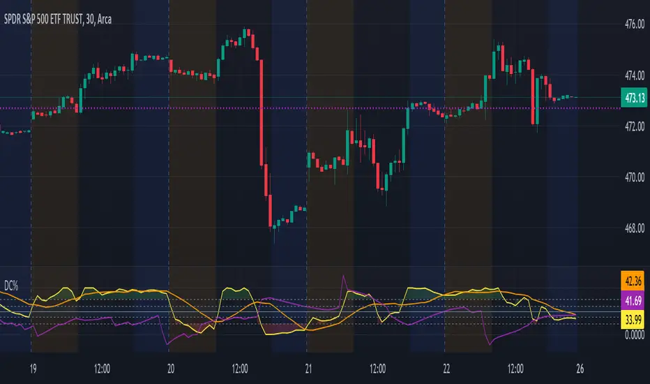
[KVA]Donchian Channel Percentage" The 'Donchian Channel Percentage ' (DC%) indicator, developed for TradingView’s Pine Script Version 5, is a unique tool designed to measure the current price’s position within the Donchian Channel. The Donchian Channel, a popular indicator in technical analysis, is defined by the highest high and the lowest low over a user-specified period.
Key Features :
User-Defined Period: Users can customize the lookback period (default 20 periods), allowing flexibility in different trading styles and timeframes.
Channel Calculation: The upper and lower bounds of the Donchian Channel are calculated based on the highest high and lowest low over the chosen period.
Percentage Calculation: DC% quantifies where the current price lies within the channel, presented as a percentage. A value of 0% indicates the price at the channel's low, and 100% signifies the price at the high.
Visualization: The DC% is plotted as a line graph, providing a clear visual representation of the price’s relative position. The indicator includes horizontal lines at 0% and 100%, marked in red and green, respectively, to depict the channel's boundaries.
Market Analysis Tool: DC% offers insights into market trends and potential overbought or oversold conditions, making it a valuable addition for traders who focus on channel-based strategies.
Applications :
The DC% is particularly useful for identifying breakout scenarios and potential reversals.
Traders can use this tool in conjunction with other indicators to enhance their market analysis, especially in strategies that capitalize on price extremes within a defined range.
In summary, the Donchian Channel Percentage offers traders a simple yet powerful tool to gauge the current price’s position within a historical high-low range. Its adaptability across various assets and timeframes makes it a versatile addition to any technical trader’s toolkit."

ATH Drawdown Indicator by Atilla YurtsevenThe ATH (All-Time High) Drawdown Indicator, developed by Atilla Yurtseven, is an essential tool for traders and investors who seek to understand the current price position in relation to historical peaks. This indicator is especially useful in volatile markets like cryptocurrencies and stocks, offering insights into potential buy or sell opportunities based on historical price action.
This indicator is suitable for long-term investors. It shows the average value loss of a price. However, it's important to remember that this indicator only displays statistics based on past price movements. The price of a stock can remain cheap for many years.
1. Utility of the Indicator:
The ATH Drawdown Indicator provides a clear view of how far the current price is from its all-time high. This is particularly beneficial in assessing the magnitude of a pullback or retracement from peak levels. By understanding these levels, traders can gauge market sentiment and make informed decisions about entry and exit points.
2. Risk Management:
This indicator aids in risk management by highlighting significant drawdowns from the ATH. Traders can use this information to adjust their position sizes or set stop-loss orders more effectively. For instance, entering trades when the price is significantly below the ATH could indicate a higher potential for recovery, while a minimal drawdown from the ATH may suggest caution due to potential overvaluation.
3. Indicator Functionality:
The indicator calculates the percentage drawdown from the ATH for each trading period. It can display this data either as a line graph or overlaid on candles, based on user preference. Horizontal lines at -25%, -50%, -75%, and -100% drawdown levels offer quick visual cues for significant price levels. The color-coding of candles further aids in visualizing bullish or bearish trends in the context of ATH drawdowns.
4. ATH Level Indicator (0 Level):
A unique feature of this indicator is the 0 level, which signifies that the price is currently at its all-time high. This level is a critical reference point for understanding the market's peak performance.
5. Mean Line Indicator:
Additionally, this indicator includes a 'Mean Line', representing the average percentage drawdown from the ATH. This average is calculated over more than a thousand past bars, leveraging the law of large numbers to provide a reliable mean value. This mean line is instrumental in understanding the typical market behavior in relation to the ATH.
Disclaimer:
Please note that this ATH Drawdown Indicator by Atilla Yurtseven is provided as an open-source tool for educational purposes only. It should not be construed as investment advice. Users should conduct their own research and consult a financial advisor before making any investment decisions. The creator of this indicator bears no responsibility for any trading losses incurred using this tool.
Please remember to follow and comment!
Trade smart, stay safe
Atilla Yurtseven

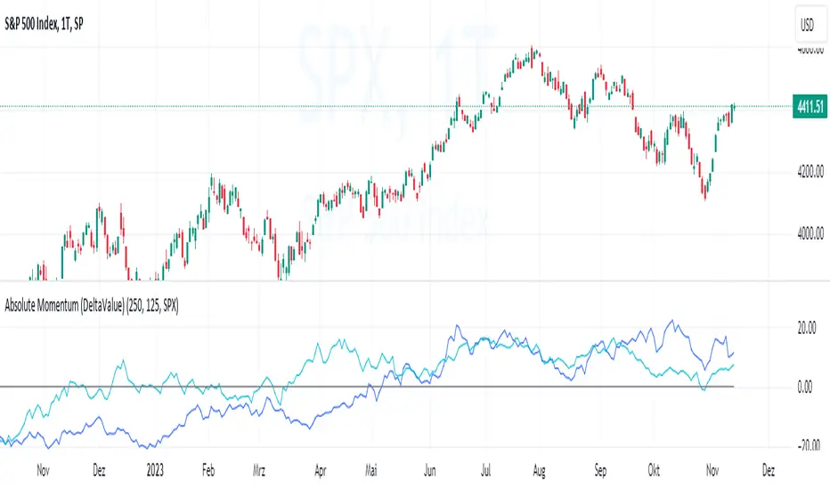
Absolute Momentum (Time Series Momentum)Absolute momentum , also known as time series momentum , focuses on the trend of an asset's own past performance to predict its future performance. It involves analyzing an asset's own historical performance, rather than comparing it to other assets.
The strategy determines whether an asset's price is exhibiting an upward (positive momentum) or downward (negative momentum) trend by assessing the asset's return over a given period (standard look-back period: 12 months or approximately 250 trading days). Some studies recommend calculating momentum by deducting the corresponding Treasury bill rate from the measured performance.
Absolute Momentum Indicator
The Absolute Momentum Indicator displays the rolling 12-month performance (measured over 250 trading days) and plots it against a horizontal line representing 0%. If the indicator crosses above this line, it signifies positive absolute momentum, and conversely, crossing below indicates negative momentum. An additional, optional look-back period input field can be accessed through the settings.
Hint: This indicator is a simplified version, as some academic approaches measure absolute momentum by subtracting risk-free rates from the 12-month performance. However, even with higher rates, the values will still remain close to the 0% line.
Benefits of Absolute Momentum
Absolute momentum, which should not be confused with relative momentum or the momentum indicator, serves as a timing instrument for both individual assets and entire markets.
Gary Antonacci , a key contributor to the absolute momentum strategy (find study below), emphasizes its effectiveness in multi-asset portfolios and its importance in long-only investing. This is particularly evident in a) reducing downside volatility and b) mitigating behavioral biases.
Moskowitz, Ooi, and Pedersen document significant 'time series momentum' across various asset classes, including equity index, currency, commodity, and bond futures, in 58 liquid instruments (find study below). There's a notable persistence in returns ranging from one to 12 months, which tends to partially reverse over longer periods. This pattern aligns with sentiment theories suggesting initial under-reaction followed by delayed over-reaction.
Despite its surprising ease of implementation, the academic community has successfully measured the effects of absolute momentum across decades and in every major asset class, including stocks, bonds, commodities, and foreign exchange (FX).
Strategies for Implementing Absolute Momentum:
To Buy a Stock:
Select a Look-Back Period: Choose a historical period to analyze the stock's performance. A common period is 12 months, but this can vary based on your investment strategy.
Calculate Excess Return: Determine the stock's excess return over this period. You can also assume a risk-free rate of "0" to simplify the process.
Evaluate Momentum:
If the excess return is positive, it indicates positive absolute momentum. This suggests the stock is in an upward trend and could be a good buying opportunity.
If the excess return is negative, it suggests negative momentum, and you might want to delay buying.
Consider further conditions: Align your decision with broader market trends, economic indicators, or fundamental analysis, for additional context.
To Sell a Stock You Own:
Regularly Monitor Performance: Use the same look-back period as for buying (e.g., 12 months) to regularly assess the stock's performance.
Check for Negative Momentum: Calculate the excess return for the look-back period. Again, you can assume a risk-free rate of "0" to simplify the process. If the stock shows negative momentum, it might be time to consider selling.
Consider further conditions:Align your decision with broader market trends, economic indicators, or fundamental analysis, for additional context.
Important note: Note: Entering a position (i.e., buying) based on positive absolute momentum doesn't necessarily mean you must sell it if it later exhibits negative absolute momentum. You can initiate a position using positive absolute momentum as an entry indicator and then continue holding it based on other criteria, such as fundamental analysis.
General Tips:
Reassessment Frequency: Decide how often you will reassess the momentum (monthly, quarterly, etc.).
Remember, while absolute momentum provides a systematic approach, it's recommendable to consider it as part of a broader investment strategy that includes diversification, risk management, fundamental analysis, etc.
Relevant Capital Market Studies:
Antonacci, Gary. "Absolute momentum: A simple rule-based strategy and universal trend-following overlay." Available at SSRN 2244633 (2013)
Moskowitz, Tobias J., Yao Hua Ooi, and Lasse Heje Pedersen. "Time series momentum." Journal of financial economics 104.2 (2012): 228-250
NDOG + ASIA CONFLUENCENDOG (New Day Opening Gap) Visualization:
The indicator identifies and visualizes New Day Opening Gaps (NDOGs), which are essentially the differences between the opening price of a new trading day and the closing price of the previous day.
For each NDOG identified, it creates a box on the chart that highlights the high and low price range of the NDOG.
The color of these boxes, as well as the number of NDOGs to be displayed, can be customized by the user.
Asia Session Highlighting:
The indicator includes a feature to highlight the Asia trading session, typically spanning from 18:00 to 00:00, but customizable to suit different time zones or preferences.
It does not dynamically calculate or display the Asia session but uses a fixed time input by the user.
The color for highlighting the Asia session can be chosen by the user.
Additional Lines on NDOGs:
The script draws horizontal lines at the high and low of each NDOG, spanning from 18:00 to 00:00, to visually represent the range of the NDOG during the Asia session.
The color of these lines can be customized.
Customizability:
The indicator provides various input options for users to customize the colors of the NDOG boxes and the lines that represent the high and low of the NDOGs.
Purpose and Usage:
This indicator is useful for traders who focus on price gaps between trading days and are particularly interested in the price action during the Asia trading session.
It helps in identifying potential zones of interest where significant price movements or trading activities could occur, especially at the opening of a new trading day.

BTC - Hotness Index### Script Description
#### BTC - Hotness Index
This Pine Script, version 4, aims to generate a "Hotness Index" for Bitcoin (BTC) trading by utilizing a Pi Cycle Top Indicator. The script operates in a daily (`1D`) time frame and involves calculating two Simple Moving Averages (SMA) based on `close` prices:
- 111-day SMA (`D_111SMA`)
- 350-day SMA (`D_350SMA`) multiplied by 2
The primary indicator (`pi_indicator`) is derived by dividing `D_111SMA` by `D_350SMA`.
##### Sell Signal
A sell signal is plotted as a histogram if `pi_indicator` crosses above 1 (`pi_plot` variable).
##### Buy Signal
A buy signal is plotted as a histogram if `pi_indicator` crosses below 0.35 (`pi_plot_buy` variable).
##### Horizontal Lines
Two horizontal lines are included to denote the "Buy Zone" and "Sell Zone":
- "Sell Zone" at `pi_indicator` level of 1
- "Buy Zone" at `pi_indicator` level of 0.35
##### Plotting
Histogram plots are used for visualizing the signals:
- Sell signals are colored red (`RGB: 255, 59, 59`)
- Buy signals are colored green (`RGB: 82, 255, 59`)
This script provides traders a visual guide for potential buy/sell opportunities based on the Pi Cycle Top Indicator and the Hotness Index for Bitcoin. It operates under the terms of the Mozilla Public License 2.0.

Volume Spike Analysis [Trendoscope]The Volume Spike Analysis is designed to detect volume spikes in a trading instrument's data. Rather than relying on the traditional method of comparing volume to its moving average, this indicator employs a distinctive approach to ensure accuracy.
Methodology
Historical Volume Comparison: The indicator first assesses the current bar's volume, say 100k, and looks back historically to determine the last instance when the volume was equal to or exceeded this level.
High Volume Bar Gap Calculation: The intervals or gaps between high volume bars are recorded. These gaps help in determining how common or rare a particular volume spike is.
Spike Magnitude Determination: Here, the extent of the volume spike is gauged in relation to either the median, lowest, or average volume of the intervening bars. The reference metric (median, lowest, or average) can be chosen by the user through the "Volume Spike Reference" input parameter.
Spike Percentile Analysis: The calculated spike magnitude (as a percentage of the reference volume) is cataloged. This collection aids in understanding the relative intensity of the current volume spike when compared to previous spikes.
Threshold Comparisons: The indicator then compares the calculated "High Volume Distance Percentile" to the "Last High Volume Distance Percentile" and the "Volume Spike Percentile" to the "Volume Spike Threshold". If these values surpass the preset thresholds, the current bar is flagged as a high volume or volume spike bar.
Visual Components
Bar Highlighting : High volume or volume spike bars are accentuated with bright colors for easy identification. All other bars have increased transparency to reduce visual clutter.
Distance from the High Volume Bar: Indication of the number of bars since the last high volume occurrence and its respective percentile.
Comparative Factors: A factor representing the magnitude by which the current volume surpasses the lowest, median, and average volumes.
Lowest, Median and Average Volumes: The lowest and median volumes are indicated by tooltips on lines marking the respective bars. The average volume is depicted as a dotted horizontal line, with a triangle marker tooltip revealing its value.
This indicator offers a nuanced analysis of volume spikes, aiding traders in making more informed decisions.

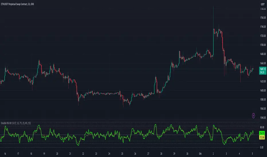
Double RSI 00 1.0This script creates a custom indicator, visualizes two RSI values (RSI1 and RSI2) on the chart and generates alerts based on different RSI-related conditions, which can be used for technical analysis and trading strategies. Users can customize the RSI parameters and alert levels according to their preferences.
It includes several input parameters that allow the user to customize the RSI calculations and overbought/oversold levels. These parameters include:
length_1: RSI1 Length (default: 7)
length_2: RSI2 Length (default: 12)
overbought_1: Overbought Signal level for RSI1 (default: 75)
oversold_1: Oversold Signal level for RSI1 (default: 25)
overbought_2: High Overbought Signal level for RSI1 (default: 85)
oversold_2: High Oversold Signal level for RSI1 (default: 15)
The script calculates two RSI values: rsi_1 and rsi_2, based on the high and low prices averaged (hl2) and the specified RSI lengths.
It plots these RSI values on the chart using different colors and line widths.
Several horizontal lines are drawn on the chart to represent key levels:
h0: 0 (Lower Band)
h1: 50 (Middle Band)
h2: 100 (Upper Band)
h3: The Oversold level (customizable)
h4: The Overbought level (customizable)
h5: The High Oversold level (customizable)
h6: The High Overbought level (customizable)
The script defines alert conditions for various signals, including overbought, oversold, high overbought, high oversold, long (crossover between RSI1 and RSI2), and short (crossunder between RSI1 and RSI2).
It sends alerts when these conditions are met, indicating potential trading signals.
Please note that this script is meant for educational purposes and should be used cautiously in a real trading environment. It's important to have a thorough understanding of technical analysis and risk management when using such indicators in actual trading.
Horizontal whole LinesThis indicator plot horizontal lines above and below the current price. they show the level of whole round number around the current price. these levels normal act as magnet where price movement tend to stop at them for a while. they can be used as support, resistance, take profit or stop limit.
AMT: Gamma Levels PlotterAMT: Custom Levels Plotter Indicator
Purpose:
This indicator is designed to allow users to directly visualize custom price levels and their associated labels on a trading chart by copying and pasting data from the Gamma spreadsheet.
Features and Functionalities:
Direct Input from Gamma Spreadsheet:
Users can effortlessly copy rows of data from the Gamma spreadsheet and paste them into the indicator's input field. Each row should represent a price level followed by a tab (\t) and its associated label. There's no need for any adjustments or formatting changes; the indicator handles it all.
Label Size Selection:
A dropdown menu lets users select the desired size for the labels. Options include "Tiny", "Small", "Normal", and "Large".
Merge Levels Option:
A checkbox determines if labels for identical price levels should be merged. When activated, labels for the same price will consolidate; otherwise, they'll display individually.
Dynamic Visualization:
A horizontal line represents the specified price level on the chart.
An adjacent label displays the associated text.
If the "Merge Levels" option is active and there are multiple labels for the same price, they merge into one.
Automatic Cleanup:
The script automatically removes all previously plotted lines and labels before drawing the new set. This ensures the chart only displays the most recent set of levels and remains uncluttered.
Efficient Data Handling:
The indicator uses the levels and counts arrays to track unique price levels and their counts. This aids in accurately positioning labels, especially when merging is enabled.
Debugging Feature:
For diagnostic purposes, the indicator plots the size of the levels array. This helps monitor the array's growth and ensures it remains within expected limits.

Xeeder - Comparison RSI IndicatorXeeder - Comparison RSI Indicator (CRI)
The "Xeeder - Comparison RSI Indicator" (CRI) is a sophisticated tool designed to assist traders in analyzing and comparing the Relative Strength Index (RSI) and Moving Averages (MA) of two different securities simultaneously. This indicator is instrumental in identifying potential shifts in market momentum and strength between two assets.
Details of the Indicator:
Security Input Settings: This feature allows traders to input the symbols of two securities they wish to compare. The input is facilitated through text boxes where traders can enter the ticker symbols of their chosen securities.
Moving Average (MA) Settings: Traders have the option to select different types of moving averages such as SMA, EMA, WMA, among others. The settings also allow for the adjustment of the length of the moving average and the standard deviation multiplier for Bollinger Bands.
RSI Settings: This section allows traders to specify the length of the RSI calculation, which is used to analyze the momentum of the securities.
Dynamic RSI and MA Plotting: The indicator plots the RSI and its moving average for both securities dynamically on the chart, with distinct colors for easy differentiation and analysis.
RSI Bands: The indicator displays multiple RSI bands (Upper Band 1 & 2, Middle Band, Lower Band 1 & 2) as dashed horizontal lines, helping traders identify potential overbought and oversold regions.
Gradient Fill for Overbought and Oversold Regions: The indicator features a gradient fill between the RSI plot and the middle line, visually representing the overbought and oversold regions in different colors.
How to Use the Indicator:
Input Security Symbols: Start by entering the symbols of the two securities you wish to compare in the respective input boxes.
Configure MA and RSI Settings: Adjust the settings for the moving average type, length, and RSI length according to your trading strategy and analysis needs.
Analyze RSI and MA Plots: Observe the plotted RSI and moving averages for both securities to analyze and compare their momentum and trend characteristics.
Utilize RSI Bands: Use the RSI bands as reference points to identify potential overbought and oversold regions, and to gauge the relative strength between the two securities.
Interpret Gradient Fill: Pay attention to the gradient fill regions which visually represent overbought and oversold conditions, assisting in the identification of potential reversal points.
Example of Usage:
As a trader with a knack for developing innovative trading strategies, you can utilize the CRI indicator to enhance your swing trading approach. Here's how you might integrate this tool into your strategy:
Select Securities: Choose two securities that you are interested in comparing, perhaps from sectors you have identified as having potential based on your macroeconomic and geopolitical analysis.
Adjust Settings: Configure the RSI and MA settings to align with the characteristics of the selected securities and your trading strategy.
Analysis and Comparison: Analyze the RSI and MA plots to identify potential divergences or correlations between the two securities, which might indicate trading opportunities.
Utilize RSI Bands: Use the RSI bands to identify potential entry and exit points, aligning them with your analysis of broader market conditions and your trading strategy.
Content Creation: Leverage the insights gained from using the CRI indicator to create captivating content for your audience, sharing your analysis and perspectives on the selected securities and market conditions.
Remember, the CRI indicator serves as a powerful tool in your trading arsenal, offering a unique perspective on market dynamics and facilitating a deeper analysis of securities. Always consider the broader market context and your trading strategy when utilizing this tool.

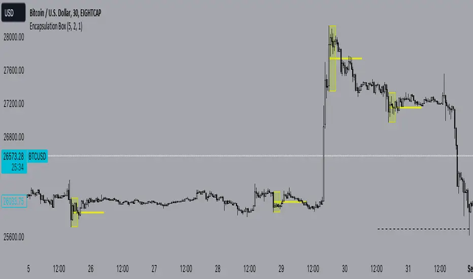
Encapsulation BoxThe “Encapsulation Box” indicator is designed to locate areas of the chart where the highs and lows of candlesticks are “embedded” or enclosed within the body of a previous candlestick. This setup indicates a significant contraction in the market and can provide important trading signals. Here's how it works in more detail:
Detecting contraction: The indicator looks for situations where the price range of the candles is very narrow, i.e. when subsequent candles have highs and lows that are contained within the range of a previous candle. This condition indicates a contraction in the market before a possible directional move.
When a contraction is detected, the indicator draws a rectangle around the area where the highs and lows of the candles are embedded. The rectangle has its upper vertex corresponding to the maximum of the candles involved and its lower vertex corresponding to the minimum. The width of the rectangle is defined by can be customized by the user.
A key feature of this indicator is the horizontal line drawn outside the rectangle. This line is positioned in the middle of the rectangle and represents 50% of the range of the rectangle itself. This line acts as a significant support or resistance level depending on the direction the contraction breaks.
The indicator can generate buy or sell signals when a break in the rectangle or horizontal line occurs. For example, if the price breaks above the rectangle and the horizontal line, it could generate a buy signal, indicating a possible uptrend. Conversely, if the price breaks below the rectangle and the horizontal line, it could generate a sell signal, indicating a possible downtrend.
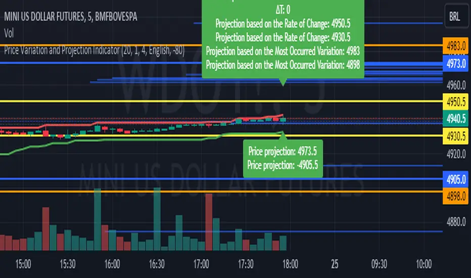
Price Variation and Projection IndicatorThis indicator calculates and visualizes various aspects of price variation and projection based on certain parameters such as rate of change, time interval, constant value, and more. It helps traders understand potential price movements and provides insights into potential support and resistance levels.
The indicator displays the following information:
Resistance and support levels based on the highest and lowest prices over a specified period.
∆P (Price Variation) calculated between two high oscillations.
∆t (Time Variation) calculated between two high oscillations.
Price variation rate.
Price projections based on rate of change and the most occurred variation.
Additionally, parallel lines are drawn to illustrate projected price ranges, and the most frequent ∆P value is shown for reference.
in short the indicator does it projects possible support and resistance for you to add a mark for example you see that it gave a projection you mark it on the chart with horizontal line or horizontal ray you can configure it by Period or by ∆t calculation limit au increase the period it will increase the projection of all targets interesting periods to use 20 50 80 120 200 since the ∆t calculation limit au decrease increases the projection in the Price projection that is showing the information in blue color when increasing it decreases the projection target ∆t calculation interesting limit to use 3 4 6 7 8 9
it works for all timeframes can be used for Swing trade or day trade
use I like to use it with a closed market that helps me to trace possible support and resistance can be used with open market as well
Choose your preferred language to display the information
Please note that this indicator is designed for educational and informational purposes. Always conduct your own analysis and consider risk management strategies before making trading decisions.
Double Supertrend HTF FilterDouble Supertrend HTF Filter: A Comprehensive Market Direction Tool
The Double Supertrend HTF Filter is an innovative tool designed for traders who seek a more holistic view of market trends. At its core, the indicator combines two Supertrends from different higher timeframes, providing a layered perspective on the market's direction. Instead of juggling between multiple timeframes or charts, traders get a consolidated view with this indicator. One of its standout features is the horizontal line at the bottom of the chart, which visually represents the alignment of the two Supertrends – a simple yet powerful way to gauge the combined sentiment of the two higher timeframes on your chart.
The Supertrend Indicator: Origins and Rationale
The Supertrend indicator, a popular tool among traders, was developed by Olivier Seban. At its essence, the Supertrend is a trend-following indicator, designed to identify and visualize the current market trend. It operates using average true range (ATR) values and price data, effectively smoothing out market noise to present clearer trend directions. When prices move with a consistent momentum upwards or downwards, the Supertrend remains below or above the price respectively, signaling the prevailing trend's direction. The rationale behind the Supertrend is its ability to adapt to price volatility. By factoring in the average true range, it dynamically adjusts itself, ensuring that it's not just based on price but also the inherent volatility of the market. This adaptability makes it a valuable tool for traders, offering insights into potential trend reversals and potential entry or exit points.
Filter Usage
The main idea behind the Double Supertrend HTF is to use the indicator as a filter in addition to a signal indicator to your liking. To illustrate, consider incorporating it with a MACD Oscillator, such as the one detailed in this article: When the solid line at the bottom of the chart turns green, it signals that both supertrends are up and thus allows for long positions, indicating a bullish sentiment across both the chosen higher timeframes. Conversely, a red line permits short positions, hinting at a bearish trend. Should the line turn yellow, it's a sign of caution. The market is indecisive, and it might be prudent to refrain from taking any trades until a clearer direction emerges.
Features of the Indicator
Understanding that traders have different preferences, the Double Supertrend HTF Filter comes with customizable features. With the easy user interface you can change the timeframe, ATR and factor to your preferred trading strategy. The default settings are set for the 30 minutes and 4 hour timeframe, which is my personal preference for scalping trades on lower timeframes (eg. 1min, 5 min, 10 min, 15 min). While the dual Supertrend lines offer valuable insights, a chart can become cluttered when combined with other indicators. Therefore, traders have the option to toggle on or off the display of the Supertrends. This ensures that you have the flexibility to maintain a clean chart view while still benefiting from the insights the tool provides at the bottom of the chart.
A Note on Usage
It's essential to highlight that the Double Supertrend HTF Filter is for educational purposes. While it offers a unique perspective on market trends and can be a valuable addition to a trader's toolkit, it's merely an example of how one can use the Supertrend as a filter. Always conduct thorough research and consider your trading strategy before making any decisions.
If you have any comments or ideas how to combine this filter with other indicators feel free to leave a comment.

Doji TrenderDoji Trender searches multiple timeframes for candles where open and close are less than dojiPercent apart (default 0.025%), and plots the trends between them.
Experiment with dojiPercent to change the number of "dojis" detected. I will add doji sub-type indication if it appears to be meaningful.
By default, it plots the 5m (red), 15m (orange), 1h (yellow), 4h (green), and chart (cyan). If the chart timeframe is any of the configurable ones, the chart copy won't be drawn. (I might reverse that, so that cyan is always drawn.)
Since doji points are somewhat sparse, and the lookback is short (default 10), the EMA's make drastic corrections toward new indecision. (I'm not convinced the EMA's are useful and/or relevant.)
This works on any timeframe, but seems to work best on the 1D. (5m is somewhat irrelevant on the 1D, so there are tweaks to be made.)
Dojis from a timeframe are corrections to a doji trend from a higher timeframe.
Red corrects to orange, corrects to yellow, corrects to green.
If the chart timeframe is > 4h, the others will correct to cyan.
Otherwise, cyan will fit in-between the adjacent timeframes.
Multiple indecision candles within a short timespan forming sharp peaks indicate retests, backtests, rejections, and bounces off of support/resistance.
With a correct larger-timeframe channel, one would expect lower-timeframe indecision at/along typical levels.
Although the doji's have unpredictable wicks, the dots printed by this indicator do not. Matched with volume, they reveal the prices where the most violent battles between bulls and bears took place, and are likely to take place, again.
One could:
1) Put trends on the longest segments, then look for confluence along them, and/or near the intersections.
2) Use lower-timeframe doji trends to estimate the direction of the higher-timeframe doji trends, before they become detectable to Doji Trender. Confirm by looking for confluence where those trends intersect with horizontal support/resistance, this indicator, and/or others.
3) Notice that multiple legs on the same trend line are close to parallel, if not colinear.
4) Notice that many of the doji segments point toward (very-distant) future dojis.
5) Drop horizontal lines on the dots where we previously reversed, and find confluence in VRVP when we revisit them.
6) Create parallel (fib/whatever) channels that more-closely match MM's intent. The segments one uses to set the angle of the channel, and those used to align the channel, vertically, are not always the same:
a) Match the channel slope to as many doji slopes as possible, considering every trend.
b) Figure out where the channel actually belongs, re-considering every trend.

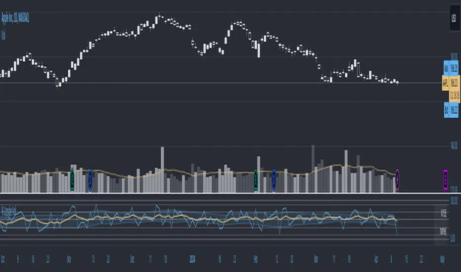
Upside Downside Unchanged VolumeUpside Downside Unchanged Volume
Plot NYSE or NASDAQ Upside Volume, Downside Volume, or Unchanged Volume (e.g. UPVOL.NY, UVOL, or ADVN.NY) as a percent (values 0 to 1, where 1 = 100%) of Total Volume.
Plot Day, Week, and Month volume and/or chart timeframe period volume.
Plot volume as a histogram, line, or area.
Plot various moving averages of volume points.
Horizontal lines at 0, 10, 30, 50, 70, 90, and 100% levels.
Inspired by Paul Desmond of Lowry’s Reports.